Tutorial: How to Make Poster in Photoshop
Either that you have a band, or a small business, or even yard sale, a poster is the best way to get informations about it across neighbourhood quickly. There is a many ways to make a beautiful poster, but today maybe the best way is with Photoshop. Later when you create a poster, you can go to any poster printing company and print your own project.
Step One:
Turn on your computer. In these times it’s the easiest and by far most effective way to create a poster. If you don’t have a graphics application such as Photoshop for your poster prints, there are a many alternatives, such as GIMP or Pixlr, which are totally free. Even if we are creating our poster in Photoshop, any other graphics application will have the similar functionality, or maybe the same one.
Step Two:
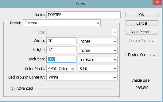
Now, let’s start Photoshop, and create a new document using the following specifications:
Width: 10 inches
Height: 12 inches
Resolution: 300pixels/inch
Color Mode: CMYK
Background Contents: White
We create a more or less standard letter-sized paper, with 300dpi (pixels per inch), which is the most important part of our task, so that our poster look nice and crisp when it’s printed. Color mode is CMYK, because printers work on that mode. If graphics app you choose does not support CMYK, it’s not a problem – the colors on your poster prints will not be exactly the same as on screen but similar.
Best way that your poster looks amazing is to find a poster printing company with a large-format printer. You may give them a call, and ask about maximum sizes and best resolution, so you can make your poster accordingly.
Step Three:
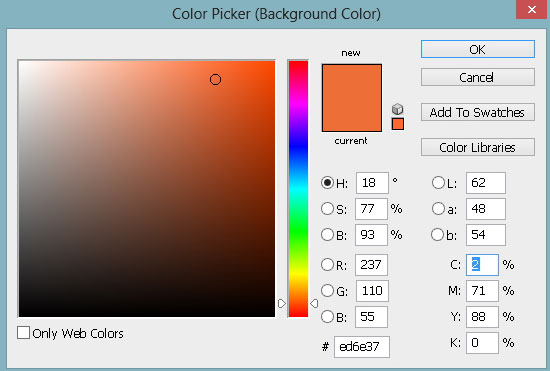
We are going to choose a background color. Best way is to make it bright and eye catching, but you must taking care that is not to bight and overwhelm the message of your poster. Best way when are working on your own computer is that you can change it later if you don’t like it.
Step Four:
Center of any poster is a great picture or graphic. If you don’t have a drawing or illustrating skills, find some free-to-use images online that you can use or change for your poster.
Step Five:
Main message need to bring attention. Put main message in large font so that attract more attention. Detailed information that you add put in smaller font size, because once you get theirs attention they will read the whole thing.
Important thing is that people can easy read your poster. Consider your font color and size, and our tips to you is that you do not mix more than 2-3 different fonts.
Step Six:
Now it’s time to put secondary information. If it’s a longer phrase, you have to shrink the font, but keep it concise as much as you can. The fewer things poster tries to convey, the message is stronger!
Step Seven:
Be sure that you check your poster before printing for typos. It’s a good idea to call someone else just for a fresh set of eyes. Be sure to spell-check the information as well.
Most important thing is to include an address or other contact information, or if we talking about an event then the event address is most important. Phone number or an e-mail address is also a great add to your poster, so that people can contact you immediately.
Step Eight:
It’s time to put your poster outside for everybody to see. There’s always a locations nearby such a big boards or something similar for that kind of stuff.



 My name is Garlak Theodorakis, I am graphic designer with almost 10 year experience in the field. Founded Tooft.com in january 2010 with idea to share my knowledge with the world.


