
Most Creative Infographics – Part 1
Infographics are very interesting thing. You can find something interesting just looking these amazing infographic pictures with little text. Many people love them, because they are simple, but very entertainment, and fun. Also there are many of them, and I tried to find the best ones. This post will have 3 parts, because these pictures are very big, and it takes too much time to load the page. They are collected from www.onlyinfographic.com, its a new site with lots of infographics. Ok, thats all, enjoy in these cool infographics…
1. Fools Gold: Inside the Glenn Beck Goldline Scheme
2. The Business Behind Facebook
3. Fun And Interesting Facts About The White House
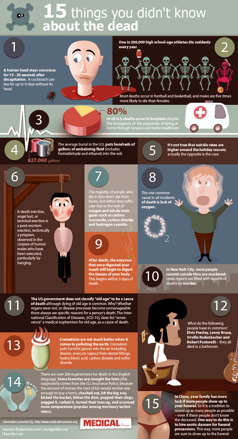
4. Things You Didn’t Know About Death
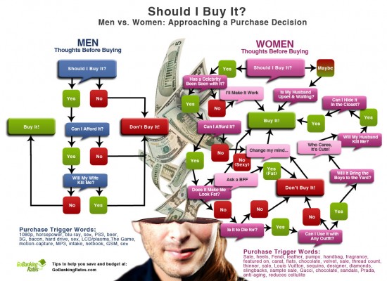
5. Men vs Women: Approaching a Purchase Decision
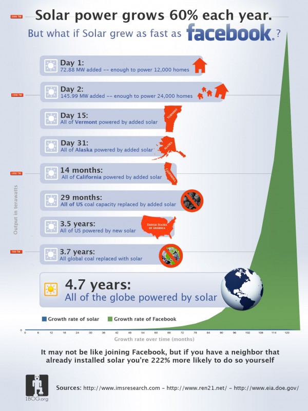
6. What if Solar Power Grew as Fast as Facebook?
7. 15 Bizarre Toilet-Related Injuries & Deaths
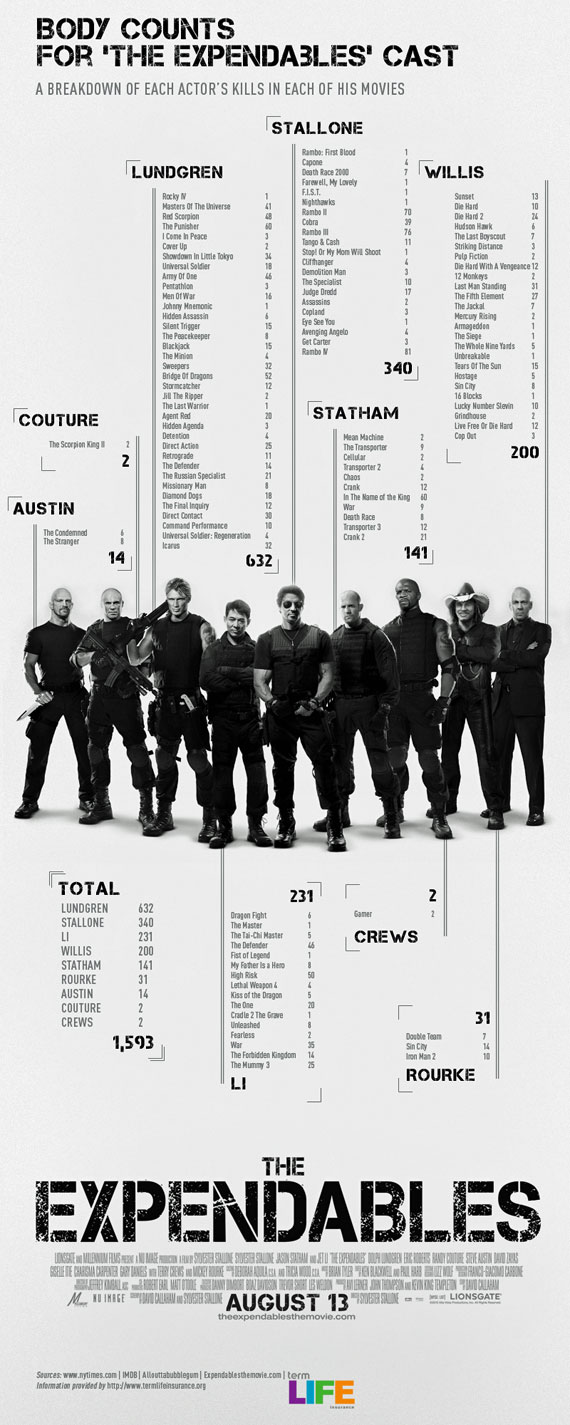
8. Body Counts for ‘The Expendables’ Cast
9. History of the Internet
10. The Automated Workplace: Robots On The Rise
11. The Billion Dollar SEO Company
12. Energy Savings of Low Hanging Fruit
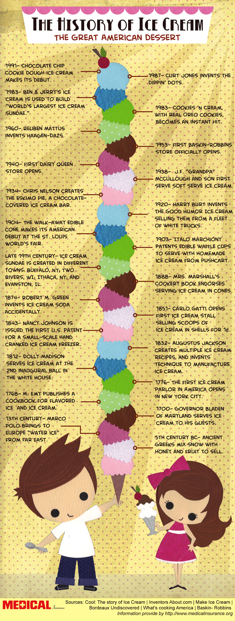
13. The History of Ice Cream





 My name is Garlak Theodorakis, I am graphic designer with almost 10 year experience in the field. Founded Tooft.com in january 2010 with idea to share my knowledge with the world.




[…] Previous- Part 1 | Next- Part 3 […]
“Infographics” have become trendy lately, but am I the only one who thinks most of them
are a simply a collection of illustrated factoids? Taking the Glen Beck/gold coins one as
an example (others are worse), the actual information content consists of a couple
paragraphs; a short email. Adding pictures of gold coins and all the other clutter adds no
information. The ice cream one is even worse. These are typical of what people are calling
“infographic” these days.
Am I crazy, or aren’t the graphics supposed to contribute information or encourage understanding? There are pie charts in the one on “Demand Media,” but they’ve been cutesified and rendered so tiny relative to the fluff, their information content has been diminished.
You don’t have to read Tufte (who is overrated, imo); just ask yourself, does this need illustration to make it more information or clearer? And if the illustration doesn’t do either, then it’s fluff.
Grumpily,
Sam
Well you see Sam, a lot of people aren’t particularly excited by reading text alone. We know
that’s where the information is. But it is boring. So adding some related graphics, even if
they don’t add and additional information, is a way to make the information look more
interesting or fun and thus more entertaining to read.
It’s the same reason that making a smiley face on a pancake using raisins makes it more
fun for kids and then more likely they are to be interested in eating it.
A piece of parsley on a dinner plate does the same thing for adults.
It’s all about presentation. A paragraph of text looks boring. Adding a colorful graphic makes
it look interesting and more likely to be read.
You understand. You were just a bit grumpy at that moment.
Dave
I agree with Sam. I love infographics, but most of these really missed the mark. Take the energy savings one for example. The graphics offer nothing to add to the information being presented. For (1. What if everybody changed a lightbulb?) the artist could have presented a graphical representation of what 60 watts (60 lightbulb graphics) would look like compared to 13 watts (13 bulbs). I skipped over most of these, but the ice cream one in particular is actually kind of unreadable. The Demand Media one looks nice but is more of a professional presentation rather than one that’s meant for the average viewer to read and understand.
That’s a great collection.
If you would like to boost your design process in seconds, check out this info-graphic design template: http://bit.ly/World-infographic