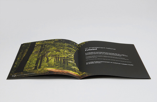
Designing a Brochure – Important Guidelines
Creating a professional brochure design is a challenging task. This task is not as easy as writing some signs and billboards. All brochures are not successful because they do not appeal to the target audience. A large number of brochures are not even picked up by the people.
A brochure generally goes through three common stages:
-
A brochure design hast to be appealing enough to motivate a reader to pick it up from a rack at a shop, library or exhibition. It should stand out and seek the attention of a recipient when he opens the mailbox.
-
Every person quickly scans a brochure to know whether picking up the brochure from the rack or the mailbox was a mistake.
-
If a brochure manages to wade through the previous 2 stages, it has to provide some value to the reader in the end.
Before you start designing a brochure, define the objective.
A large number of brochure designers have little or no idea of the actual objective. It is very important to just focus on the direct objective of a brochure instead of talking about a dozen products, company profile or history of a district. A brochure
Consider the target audience.
It is advisable to study demographics of the target audience in such cases. Some important demographics include age, educational qualification, income level etc. Your ultimate objective is to communicate a ‘message’ to the audience and make them act. It is always a good idea to consider the emotional response of a viewer.
Brochure design tips for theme, structure and text
Once you have a good understanding of the exact goal and target audience, you can start designing the brochure. Always remember the golden rule of designing – ‘Form follows function.’ Experienced designers understand the importance of this rule. Experienced graphic designers spend bulk of their time on understanding the goal, target audience and not colors and layouts. A business prints brochure to deliver the desired message. In other words, a brochure design has to communicate the message within a short timeframe.
-
Throughout the brochure design, try to maintain a uniform feel. There is no need to use multi-colored text on a brochure. High color contrast in various design elements can repel viewers very quickly.
-
Users can distinguish important information in a brochure more easily when the design is created in some selected colors. You can have 1 or 2 background colors along with a soothing highlighting color for the best effect.
-
Make sure you leave enough margins between different grids. A brochure shouldn’t appear cluttered in any case. You can break the entire grid of the brochure into different parts. Just make sure that all these parts fit in.
-
Choosing suitable fonts is extremely important to make a viewer go through the essential information on a brochure. A font is not readable at all sizes. Make sure you are viewing your brochure in the real resolution when finalizing fonts for titles, subheadings and text.
-
Always remember the fact that the text on a brochure is read more by a viewer when you sprinkle fewer words around various graphic elements. Viewers merely scan text-heavy brochures and put them away.
-
Pay attention to how a headline is shown on a brochure. Also, you should make sure that other information in the design is readable. A viewer should be able to understand your ‘message’ in about 10-12 seconds.
-
Not everyone is going read your brochure after picking it up from a rack or a mailbox. However, every one of them will look at it. Therefore, make sure the design includes some great pictures. Use a few but the best pictures on a brochure.
-
Brochures have to wade through the competition on a rack. Your brochure will scream out loudly to the target audience when you pay attention to the cover page design. Your brochure cover must intrigue a viewer immediately. The cover page design has just one goal – to make people pick up the brochure.
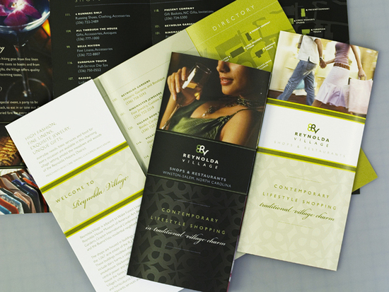
Make sure a brochure also carries some permanent value. A viewer will carry a brochure only if it has something useful in it. It can be anything such as contact information, promo codes, addresses, maps, product lists etc.

 My name is Garlak Theodorakis, I am graphic designer with almost 10 year experience in the field. Founded Tooft.com in january 2010 with idea to share my knowledge with the world.






Try to look for a gta san andreas game gta cheat code for gta san andreas game…
i like your page …..