7 Winning Tips to Create A Mobile Version of a Website
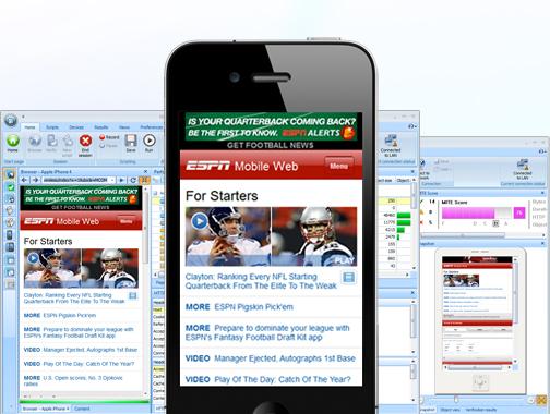
Number of smartphone users are rising consistently and thereby putting equal amount of pressure on online marketers and website owners create a mobile friendly version of their websites. Now, how we are supposed to achieve this? No, just slapping some images and texts here and there or squeezing things small is not going to help either. Moreover, there are so many different species of mobile devices available that it might spin your head when you are to choose the precise screen resolution for the would-be mobile version. But despite all these hardships, a mobile version of a website is a necessity and ignoring it would be just be spoiling the chances. So, if you  do not wish to miss out on this opportunity, here we are going to list some tips that you will certainly like to give a go:
Select The Domain: It is not good idea to have different domains for mobile versions and desktop version. Users are less likely to remember two different versions of your websites while juggling between desktop and mobile and if this is not enough, you are just splitting the importance of the website by doing so. Moreover, having two domains is not good for brand presence as well. It makes sense to select a subdomain for mobile version of a website. It may look like this – http://mobile.example.com or http://m.example.com . Make sure your visitors are informed that the mobile version of your website is available when they are browsing the desktop version of your websites from their mobile. Alternatively, you can instruct the browser to show the mobile version of your website, whenever it is accessed via mobile devices.
Avoid Information Overload: You should not expect that the mobile browsers will look for a website that stuffed with content to the point of being crushed. Since the speed is a factor here, you should make sure that the mobile version of your website is not crammed with unnecessary information. The main intension of vast majority of mobile browsers is to get some quick update and it is highly unlikely that they will go through the entire post. Try to keep things compact and present thing via a neat and clear interface.
Scale Down File Size: Speed is definitely a factor if you wish to rule in the mobile market. To make your website load faster, you need to reduce the size of the files to minimum. Try to squeeze the file to maximum 20Kb and under any obligation, it should not cross 50kb otherwise, it will just kill that page.
Perfect Coding: Since mobile browsers are still in their development stage, they are ill equipped to bypass programming errors that you might have committed while developing the website. Desktop browsers have got a bit sophisticated and that means they can easily ignore serious error but the same is not true with mobile browsers. You need to be a bit extra cautious while developing mobile version of your website.
Not Good, Create Great Navigation: A complicated navigation is a big No No with mobile websites. Since not all users have latest smart phones, you need to make sure that the navigation is simple enough to browse your website even with most basic version. Try to have buttons with tactile sensations as it will make your website look great while browsing in iPhone and other latest version of smartphones.
Test, Test and Test: Since there are innumerable variations of mobile Os and browsers available, it may not possible for you to check your website in all of them. But still if you are after better users’ experience, you should continue your effort and strive to test the mobile version of your website in as many different browsers as possible.


That is really cool, I can’t wait to try it out for myself. Your last post helped me get my blog mobile ready now this is the next step. Does this cost any money?
The FUTURE of web design is going to be mobile. Having a responsive website design is critical. I take all my mobile designs to task with remote Usability Testing (such as http://www.usertesting.com) to see what real website users really think while they use my mobile websites. Even when i think I got it right I am always amazed at what I find watching others use my designs.
Really a great post i m also a web application developer and i m eager to learn new thing and i m going to try this now. Thanks again
What’s up, this weekend is pleasant in favor of me, because this point in time i am reading this enormous informative piece of writing here at my home.
Try to look for a gta san andreas game gta cheat code for gta san andreas game…
thanks for such a useful post mobile is future of technology and we also move on that i will soon create my blog in mobile version soon once again thanks for post.