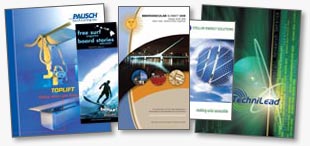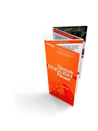
The 3 Finer Points of Quality Brochures
Do you have brochures? If so, then you’re definitely moving in the right direction — though there’s always room for progress! However, if you don’t have brochures already in your business, chances are good that it’s because you haven’t really found a way to create brochures that get attention. Like other forms of advertising, brochures are downright vital and key to building a great business. Even if you’re talking about trying to build an online business, you will still get a lot of value from brochures.
Yet a lot of people that don’t have a background in graphic design have a hard time getting quality brochures that actually work. Thankfully, it’s not really that difficult to build an effective brochure — there’s just three points that you need to keep in mind.
First and foremost, you will need to make sure that your brochure is easy to navigate. That means that the graphic elements of style should be present, but not overwhelming. People will still need to read the brochure to figure out the highlights of what you’re trying to offer them.
From here, your brochure needs to be on good paper. It’s tempting to just go with the most inexpensive paper choice, but you send a message to your prospects that your business isn’t as serious to you as it should be. This can turn away people that would have actually purchased form you if you had made a serious investment in the quality of the brochure that you send out. Sometimes when we think that we have a layout that’s worth sending out, it can help to have a colleague or a close friend check it out — they can often catch things that you might have missed, like spelling errors or two colors that just don’t match up right.
Finally, you will need to make sure that you really spend time checking over the entire layout of the brochure as a whole. Yes, this is something that you touched on in the first step, but the final step should really be devoted to finishing. Brochures sell, inform, educate, and they do one thing above all others: they build a connection between your prospects and your company. If people feel a connection and a true desire to help them, and they will be much more receptive to hearing about what products and services that you offer. It just makes sense to take steps to build a winning brochure, and if you follow the steps in this guide, theres no way that you won’t get that!

 My name is Garlak Theodorakis, I am graphic designer with almost 10 year experience in the field. Founded Tooft.com in january 2010 with idea to share my knowledge with the world.


Hi! Great post! 🙂