20 Best Monochromatic Websites for Inspiration
Color in design can be a powerful tool. The choice of color on your website will impact your audience greatly and influence them either positively or negatively. Choosing a monochromatic color scheme for your website is a bold decision, simply because you are limiting yourself to only one color. Not all hues within a specific color complement each other, and you also risk creating a boring design. If you can accomplish the challenge of one color, several hues, however, you will have a very impressive site. Check out the following very effective monochromatic websites and learn how these talented designers pulled off the use of a limited color scheme.

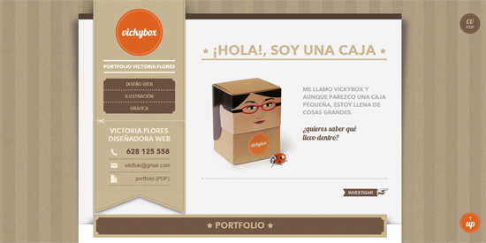
Shades of taupe make a wonderful backdrop that places the focus on the subject. It is clean, sophisticated, and downright chic.
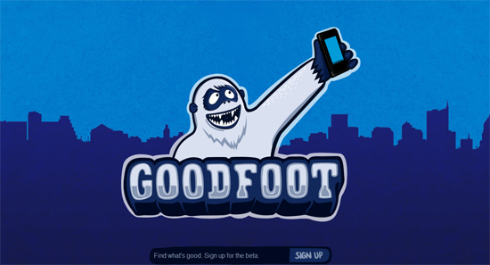
A fun shade of blue on blue makes this website really pop. There is nothing boring about this monochromatic color scheme.
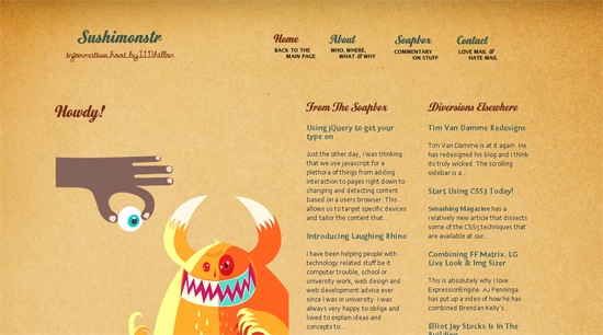
The texture of this gold background gives some depth to a very subtle website. Dark gold headlines stand out nicely.
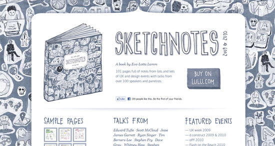
By keeping the color simple and consistent, the busy lines of sketches are made to look clean and organized.

These “hot” shades of orange make for a powerful and impactful website.

The gray on gray suit shows off its chic design, giving the image interest and character.
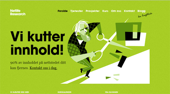
A bold green like this one contrasts with the black and white lettering perfectly.
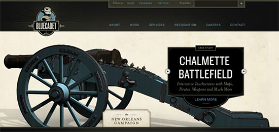
This very subtle tone on tone background sets the stage for images to star on this website.
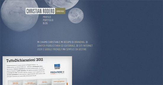
Soft blue hues in a gently textured background make this site soothing. The white text looks really nice against it also.
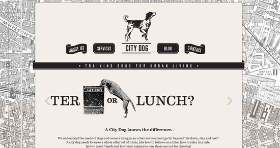
Black and white images and text give this dog training website some sophistication. It also makes the site seem older and established.
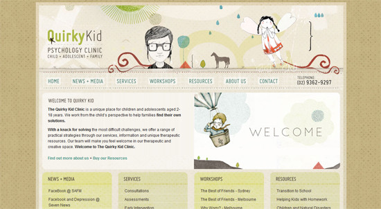
Pale earthy colors and neutral hues are a big part of the charm and character of this website.
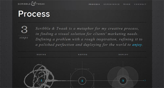
Very light gray text pops off the dark gray background nicely. The brightly colored graphics stand out very well also.
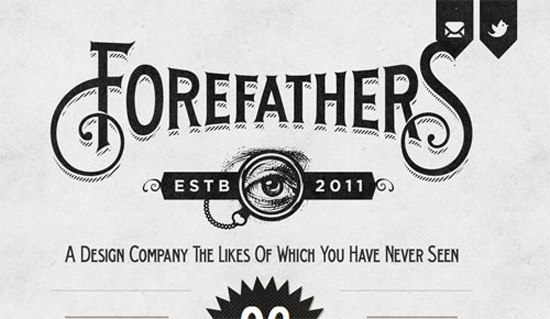
A soft black on a very light gray background has an aged effect that adds a nostalgic quality to this fun design.

All of the red on this website gives it a great deal of energy.
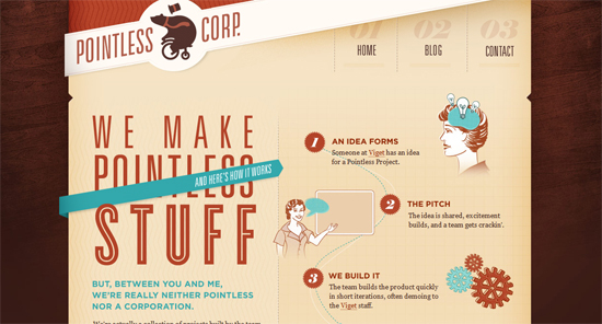
Shades of a reddish brown look charming on this nostalgic design. The entire atmosphere of this website is enhanced by the monochromatic color scheme.
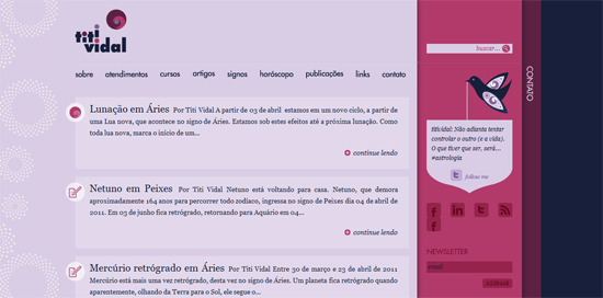
The bold contrast of light and dark purples give a pleasant feel to this website.
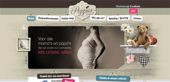
All of the fun textures are made coherent by the monochromatic color choices. This is a sophisticated example of tone on tone used on websites.
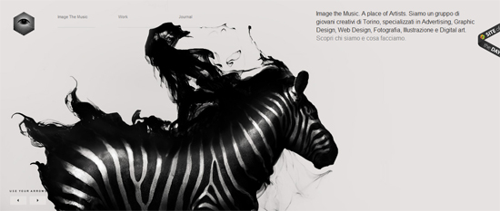
This very cool black and white zebra graphic takes center stage on this black and white website.

The earthy tones of this website match the graphics and fonts perfectly.
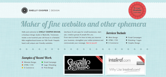
This baby blue tone on tone creates a lovely background for white and black text.





Tara, thanks for reporting my site 🙂
I’m really impressed with your writing abilities as smartly as with the structure for your weblog. Is this a paid topic or did you modify it yourself? Anyway stay up the nice quality writing, it’s rare to see a nice weblog like this one these days..
Excellent post. I was checking constantly this blog and I’m inspired! Extremely helpful information specially the remaining part 🙂 I handle such info a lot. I was looking for this particular information for a long time. Thank you and best of luck.
My developer is trying to persuade me to move to .net from PHP. I have always disliked the idea because of the costs. But he’s tryiong none the less. I’ve been using Movable-type on numerous websites for about a year and am worried about switching to another platform. I have heard excellent things about blogengine.net. Is there a way I can import all my wordpress content into it? Any help would be really appreciated!
Tara, thanks for reporting my site
I love monochromatic trend. Just like chanel collections 🙂
was just about to hate google when I ultimately found your site! THX !